Sunday, March 22, 2009
Saturday, March 21, 2009
Wednesday, March 18, 2009
Operating System Interface Design Between 1981-2009
Sent to you by Ranji via Google Reader:
via Webdesigner Depot by Gyorgy on 3/11/09

Over the years a range of GUI's have been developed for different operating systems such as OS/2, Macintosh, Windowsamiga, Linux, Symbian OS, and more.
We'll be taking a look at the evolution of the interface designs of the major operating systems since the 80's.
I should mention that this article showcases only the significant advances in GUI design (not operating system advances) and also not all of the graphical user interfaces and operating systems existing today.
The first GUI was developed by researchers at Xerox Palo Alto Research Center (PARC) in the '70s. This research opened a whole new era of computer graphic innovations.
The first personal computer which used a modern graphical user interface was the Xerox Alto, developed in 1973. This was not a commercial product and was intended mainly for research at universities.

1981-1985
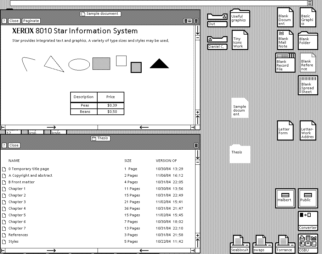
Xerox 8010 Star (released in 1981)
This was the first system that was referred to as a fully integrated desktop computer including applications and a GUI. It was known as "The Xerox Star", later renamed "ViewPoint" and later again renamed to "GlobalView".
Xerox 8010 Star, Source: toastytech.com
Apple Lisa Office System 1 (released in 1983)
Also referred to as Lisa OS, which in this case is short for Office System. It was developed by Apple with the intention of being a document processing workstation.
Unfortunately this workstation didn't last, it was killed by Apple's Macintosh operating system that was more affordable.
There were upgrades to Lisa OS, Lisa OS 2 in 1983 and Lisa OS 7/7 3.1 in 1984, that upgraded the system itself, but not the graphical user interface.
Apple Lisa OS 1, Source: GUIdebook

Apple Lisa OS 1, Source: GUIdebook

VisiCorp Visi On (released in 1984)
Visi On was the first desktop GUI developed for the IBM PC. This system was targeted towards big corporations and came with a high price tag. The GUI made use of a mouse, it had a built-in installer and help system and it didn't use icons.
VisiCoprt Visi On, Source: toastytech.com

VisiCoprt Visi On, Source: toastytech.com

Mac OS System 1.0 (released in 1984)
System 1.0 was the first operating system GUI developed for the Macintosh. It had several features of a modern operating system, being windows based with icons. The windows could be moved around with the mouse and files and folders could be copied by dragging and dropping onto the target location.
Apple Mac System 1.0, Source: toastytech.com

Amiga Workbench 1.0 (released in 1985)
When first released, Amiga was ahead of its time. The GUI included features such as color graphics (four colors: black, white, blue, orange), preemptive multitasking, stereo sound and multi-state icons (selected and unselected).
Amiga Workbench 1.0, Source: GUIdebook

Amiga Workbench 1.0, Source: GUIdebook

Windows 1.0x (released in 1985)
In this year Microsoft finally caught up with the whole graphical user interface craze and released Windows 1.0, its first GUI based operating system (although no one would dare to refer to it as one). The system featured 32×32 pixel icons and color graphics. The most interesting feature (which later was omitted) was the icon of the animated analog clock.
Microsoft Windows 1.01, Source: makowski-berlin.de

Microsoft Windows 1.01, Source: makowski-berlin.de

GEM (released in 1985)
GEM (Graphical Environment Manager) was a windowing style GUI created by Digital Research, Inc. (DRI). It was initially created for use with the CP/M operating system on the Intel 8088 and Motorola 68000 microprocessors and was later developed to run on DOS as well. Most people will remember GEM as the GUI for the Atari ST computers. It was also used on a series Amstrad's IBM compatible computers. It was the core for Ventura Publisher and a few other DOS programs. The GUI was also ported to other computers but did not gain popularity on them.
Source: Wikipedia

1986 - 1990
IRIX 3 (released in 1986, first release 1984)
The 64-bit IRIX operating system was created for UNIX. An interesting feature of this GUI is the support for vector icons. This feature was built into the GUI long before Mac OS X even existed.
Silicon Graphics IRIX 3.0, Source: osnews.com

GEOS (released in 1986)
The GEOS (Graphic Environment Operating System) operating system was developed by Berkeley Softworks (later GeoWorks). It was originally designed for the Commodore 64 and included a graphical word processor, called geoWrite and a paint program called geoPaint.
Source: Wikipedia

Windows 2.0x (released in 1987)
In this version, the actual management of the windows had significantly improved. The windows could be overlapped, resized, maximized and minimized.
Microsoft Windows 2.03, Source: guidebookgallery.org

Microsoft Windows 2.03, Source: guidebookgallery.org

OS/2 1.x (released in 1988)
OS/2 was originally co-developed by IBM and Microsoft, but in 1991 the two companies split up, with Microsoft incorporating the technology in its own Windows GUI and IBM developing OS/2 further. The GUI used in OS/2 was called "Presentation Manager". This version of the GUI only supported monochrome, fixed icons.
Microsoft-IBM OS/2 1.1, Source: pages.prodigy.net

Microsoft-IBM OS/2 1.1, Source: pages.prodigy.net

NeXTSTEP / OPENSTEP 1.0 (released in 1989)
Steve Jobs came up with the idea to create the perfect research computer for universities and research labs. This idea later evolved into a startup called NeXT Computer Inc.
The first NeXT computer was released in 1988, however significant advances were made in 1989 with the release of the NeXTSTEP 1.0 GUI, which later evolved into OPENSTEP.
The GUI's icons were bigger (48×48) and it introduced more colors. The GUI was initially monochrome, but version 1.0 started supporting color monitors too. This screenshot gives you have a peek into what would become the modern GUIs.
NeXTSTEP 1.0, Source: kernelthread.com

OS/2 1.20 (released in 1989)
The next minor version upgrade of the GUI showed slight improvements in many areas. The icons looked nicer and the windows were smoother.
OS/2 1.2, Source pages.prodigy.net

Windows 3.0 (released in 1990)
By this version, Microsoft had realized the real potential in GUI's and started to significantly improve them.
The operating system itself supported standard and 386 enhanced modes, which made use of higher memory capacity than 640 KB and hard disk space, resulting in the ability to use higher screen resolutions and better graphics, such as Super VGA 800×600 and 1024×768.
Also, Microsoft hired Susan Kare to design the Windows 3.0 icons and to add a unified style to the GUI.
Microsoft Windows 3.0, Source: toastytech.com

Microsoft Windows 3.0, Source: toastytech.com

1991 - 1995
Amiga Workbench 2.04 (released in 1991)
Many improvements were made to this version of the GUI. The color scheme changed and a 3D look was introduced. The desktop could be divided vertically into screens of different resolutions and color depths, which nowadays seems a little odd. The default resolution of Workbench was 640×256, but the hardware supported larger resolutions too.
Commodore Amiga Workbench 2.04, Source: guidebookgallery.org

Mac OS System 7 (released in 1991)
Mac OS version 7.0 was the first Mac OS GUI which supported colors. Subtle shades of grey, blue and yellow were added to icons.
Apple Mac OS System 7.0, Source: guidebookgallery.org

Apple Mac OS System 7.0, Source: guidebookgallery.org

Windows 3.1 (released in 1992)
This version of Windows included TrueType fonts which were pre-installed. This effectively made Windows a functional desktop publishing platform for the first time.
Previously, it was only possible to achieve such functionality in Windows 3.0 using the Adobe Type Manager (ATM) font system from Adobe. This version also contained a color scheme named Hotdog Stand, which contained bright hues of red, yellow and black.
This color scheme was designed to help people with some degree of color blindness see text/graphics on the screen easier.
Source: Wikipedia

OS/2 2.0 (released in 1992)
This was the first GUI that was subjected to international acceptance, usability and accessibility testing. The entire GUI was developed using object-oriented design. Every file and folder was an object which could be associated with other files, folders and applications. It also supported drag and drop functionality and templates.
IBM OS/2 2.0, Source: toastytech.com

IBM OS/2 2.0, Source: toastytech.com

Windows 95 (released in 1995)
The user interface was completely re-designed since version 3.x. This was the first Windows version where a small close button was added to each window.
The design team gave states (enabled, disabled, selected, checked, etc.) to icons and other graphics. The famous Start button appeared for the first time.
This was a huge step forward for Microsoft regarding the operating system itself and the unified GUI.
Microsoft Windows 95, Source: guidebookgallery.org

Microsoft Windows 95, Source: guidebookgallery.org

1996 - 2000
OS/2 Warp 4 (released in 1996)
IBM released OS/2 Warp 4 which brought a significant facelift to the workspace.
Icons were placed on the desktop, where custom files and folders could also be created. The shredder appeared which was similar to Windows' Recycle Bin or Mac OS's Trash, except it deleted the file or folder instantly and didn't store any additional copies for later retrieval.
IBM OS/2 Warp 4, Source: toastytech.com

IBM OS/2 Warp 4, Source: toastytech.com

Mac OS System 8 (released in 1997)
256 color icons were the default in this version of the GUI. Mac OS 8 was one of the early adopters of isometric style icons, also called pseudo-3D icons. The platinum grey theme used here became a trademark for future versions of the GUI.
Apple Mac OS 8, Source: guidebookgallery.org

Windows 98 (released in 1998)
The icon styles were almost the same as in Windows 95, but the whole GUI could use more than 256 colors for rendering. Windows Explorer changed almost completely and the "Active Desktop" appeared for the first time.
Microsoft Windows 98, Source: toastytech.com

KDE 1.0 (released in 1998)
This is how the KDE team described the project upon releasing version 1.0: "KDE is a network transparent, contemporary desktop environment for UNIX workstations. KDE seeks to fill the need for an easy to use desktop for Unix workstations, similar to the desktop environments found under the MacOS or Window95/NT. A completely free and open computing platform available to anyone free of charge including its source code for anyone to modify."
Source: Wikipedia

BeOs 4.5 (released in 1999)
The BeOS operating system was developed for personal computers. It was originally written by Be In in 1991 to run on BeBox hardware. It was later further developed to take advantage of newer technologies and hardware such as symmetric multiprocessing by utilizing modular I/O bandwidth, pervasive multithreading, preemptive multitasking and a custom 64-bit journaling file system known as BFS. The BeOS GUI was developed on the principles of clarity and a clean, uncluttered design.
Source: Wikipedia

GNOME 1.0 (released in 1999)
GNOME desktop was mainly developed for Red Hat Linux, later it was developed for other Linux distributors as well.
Red Hat Linux GNOME 1.0.39, Source: visionfutur.com

2001 - 2005
Mac OS X (released in 2001)
In early 2000 Apple announced their new Aqua interface and in 2001 the company released it with their brand new operating system called Mac OS X.
The default 32 x 32 and 48 x 48 icons were changed to big 128 x 128 anti-aliased and semi-transparent icons.
Lots of criticism followed after the release of this GUI. Apparently users were not quite ready for such a big change, but soon enough they adopted the new style and today this GUI represents the basis of all Mac OS X operating systems.
Apple Mac OS X 10.1 Source: guidebookgallery.org

Windows XP (released in 2001)
As Microsoft tends to change their GUI completely with every major operating system release, Windows XP was no exception. The GUI itself is skinnable, users could change the whole look and feel of the interface. The icons were 48 x 48 in size by default, rendered in millions of colors.
Microsoft Windows XP Professional, Source: guidebookgallery.org

KDE 3 (released in 2002)
Since version 1.0, the K Desktop Environment improved significantly. They polished all the graphics and icons and unified the whole user experience.
KDE 3.0.1, Source: netbsd.org

2007 - 2009 (current)
Windows Vista (released in 2007)
This was Microsoft's response to their competition. They also included quite a lot of 3D and animation. Since Windows 98, Microsoft has always tried to improve the desktop. With Windows Vista they released widgets and a somewhat improved replacement of the Active Desktop.
Microsoft Windows Vista, Source: technology.berkeley.edu

Mac OS X Leopard (released in 2007)
With their 6th generation, Mac OS X system Apple, once again improved the user interface. The basic GUI is still the Aqua with its candy scroll bars and platinum grey, blue colors. The new GUI features a more 3D look, with the 3D dock and lots more animation and interactivity.
Apple Mac OS X 10.5 Leopard, Source: skattertech.com

GNOME 2.24 (2008)
GNOME put a lot of effort into creating the themes and artwork into v2.2.4 as their aim is "to make your computer look good". They ran a competition to collect some of the most intruiging desktop backgrounds that their contributors have produced for use in v2.24.
Source: gnome.org

KDE (v4.0 Jan. 2008, v4.2 Mar. 2009)
Version 4 of K Desktop Environment produced many new improvements to the GUI such as animated, smooth, efficient window management and support for desktop widgets. The icons size are easily adjustable and almost every design element is much easier to configure. Some of the most noticeable changes include new icons, themes and sounds, which are provided by the Oxygen Project. These icons are more photorealistic. It is definitely a big improvement to the earlier versions of KDE. It can now also be run on Windows and Mac OS X platforms.
Source: Wikipedia

Acknowledgments
- Huge thanks to Guidebook for the continuous work on GUI design. http://www.guidebookgallery.org/
- Also, big thanks to Nathan Toasty's graphical user interface gallery. http://toastytech.com/guis/index.html
Written and compiled exclusively for WDD by Gyorgy Fekete.
What do you think of the evolution of these designs? What other improvements would you like to see? Please share with us…
Things you can do from here:
- Subscribe to Webdesigner Depot using Google Reader
- Get started using Google Reader to easily keep up with all your favorite sites
Sunday, March 15, 2009
Don’t be Too Quick to Judge
Sent to you by Ranji via Google Reader:
via Thought Clusters by Krishna Kumar on 3/14/09
Sometimes, people can be too clever by half. When it comes to knowledge of understanding other people, everybody thinks they are an expert. They think they can understand the motivations of others based on one or two interactions when, in fact, they are drawing upon stereotypes and are making wrongful assumptions. People who are quick to form impressions of others set themselves up for failure, especially those who are disposed to mistrust of others.
A jaundiced and cynical view of the world pushes away people who want to help. It attracts people who want to feed the venom of hatred and bitterness. It keeps problems festering and avoids dealing with issues before they become serious. It prevents one from taking advantage of opportunities. And above all, it destroys something human in us, the ability to empathize with others.
I am reminded of "Good Will Hunting" where the Matt Damon character, Will, makes an infuriating remark about Sean Maguire (played by Robin Williams), a therapist trying to help him, after seeing a picture of Sean's. As reply, in one of the most moving movie speeches ever, Robin Williams explains why Will is wrong to base his judgment on one single observation of his life.
Sean: So if I asked you about art, you'd probably give me the skinny on every art book ever written. Michelangelo, you know a lot about him. Life's work, political aspirations, him and the pope, sexual orientations, the whole works, right? But I'll bet you can't tell me what it smells like in the Sistine Chapel. You've never actually stood there and looked up at that beautiful ceiling; seen that.
If I ask you about women, you'd probably give me a syllabus about your personal favorites. You may have even been laid a few times. But you can't tell me what it feels like to wake up next to a woman and feel truly happy.
You're a tough kid. And I'd ask you about war, you'd probably throw Shakespeare at me, right, "once more unto the breach dear friends." But you've never been near one. You've never held your best friend's head in your lap, watch him gasp his last breath looking to you for help.
I'd ask you about love, you'd probably quote me a sonnet. But you've never looked at a woman and been totally vulnerable. Known someone that could level you with her eyes, feeling like God put an angel on earth just for you. Who could rescue you from the depths of hell. And you wouldn't know what it's like to be her angel, to have that love for her, be there forever, through anything, through cancer. And you wouldn't know about sleeping sitting up in the hospital room for two months, holding her hand, because the doctors could see in your eyes, that the terms "visiting hours" don't apply to you.
You don't know about real loss, 'cause it only occurs when you've loved something more than you love yourself. And I doubt you've ever dared to love anybody that much. And look at you... I don't see an intelligent, confident man... I see a cocky, scared shitless kid. But you're a genius Will. No one denies that. No one could possibly understand the depths of you. But you presume to know everything about me because you saw a painting of mine, and you ripped my […] life apart.
You're an orphan right? [Will nods] You think I know the first thing about how hard your life has been, how you feel, who you are, because I read Oliver Twist? Does that encapsulate you? Personally... I don't give a shit about all that, because you know what, I can't learn anything from you, I can't read in some […] book. Unless you want to talk about you, who you are. Then I'm fascinated. I'm in. But you don't want to do that do you sport? You're terrified of what you might say. Your move, chief.
I wonder how many times we have labeled, condemned or written off someone because of one incident, one misunderstanding, one assumption. That is one thing which has to change if we are to make our relationships (business and personal) work.
Krishna Kumar (http://www.krishami.com)


Things you can do from here:
- Subscribe to Thought Clusters using Google Reader
- Get started using Google Reader to easily keep up with all your favorite sites
Subscribe to:
Posts (Atom)